UIXPulse Creative Agency

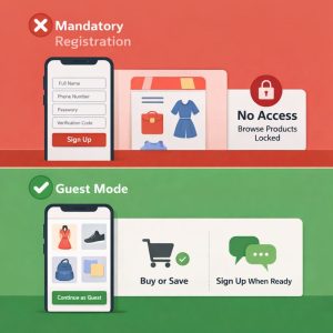
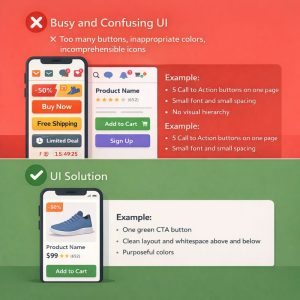
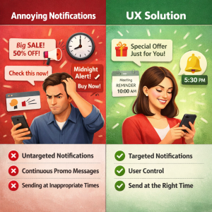
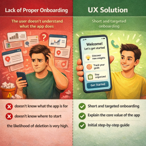
Why do users delete apps?

7 UX/UI Mistakes That Will Turn Users Away in Less Than 30 Seconds

Today, users only give your app one chance.
If the first experience is bad, the app will inevitably be deleted; even if you have the best idea, the strongest backend, or the highest advertising spend.

In this article, we explore why users delete apps and how UX/UI mistakes can lead to this quick and fatal decision.

Alarming statistics (to understand the depth of the disaster)

  • Over 70% of users delete apps within the first 3 days
  • 88% of users never return after a bad user experience
  • Top reason for app deletion: Poor UX

Mandatory registration on first login

❌ One of the most common UX mistakes: The user doesn’t yet know what the app is worth, but is presented with a registration form, mobile number, password, and verification code.

Practical example:

  • A shopping app that:
  • Forces the user to register before viewing products
  • or even searching → Immediate removal

✅ UX Solution:

  • Guest Mode
  • Register only when taking important action (purchase, save, message)

Busy and confusing user interface

❌ Too many buttons, inappropriate colors, incomprehensible icons
The user decides to stay or leave in the first 5 seconds.

Example:

  • 5 Call to Action buttons on one page
  • Small font and small spacing
  • No visual hierarchy

✅ UI Solution:

  • One Main CTA on Every Page
  • White Space
  • Limited and Purposeful Colors

Slow speed and latency in interactions

Slow UX = Zero Trust

User taps button and nothing happens?
User mind: “Wreck!”
Next finger: Delete 🗑️

Example:

  • Long loading of lists
  • No Loading or Skeleton
  • Delay in changing pages

✅ UX Solution:

  • Visual Feedback (Loading, Animation)
  • Skeleton Screen
  • Displaying Operation Progress

Complicated and illogical paths

When a simple task has 6 steps!

❌ The user has to go through several incomprehensible pages to:

  • Buy
  • Post an ad
  • Send a message

Example:

Registering an order in the app:
Home → Category → Filter → Details → Register → Confirm → Payment ❌


✅ UX Solution:

  • Simplify User Flow
  • Eliminate Unnecessary Steps
  • Use Familiar Patterns

Ignoring actual user behavior

Many apps are:

  • designed without user research
  • without testing

without behavioral analysis

Example:

The designer thinks the filters are obvious,

but the user can’t find them at all.

✅ UX Solution:

  • User Research
  • Usability Testing
  • User Behavior Analysis

Annoying notifications

❌ Untargeted notifications
❌ Continuous promotional messages
❌ Sending at inappropriate times

✅ UX Solution:

  • Targeted Notifications
  • User Control
  • Send at the Right Time

Lack of proper onboarding

The user doesn’t understand what the app does

If the user:

  • doesn’t know what the app is for
  • doesn’t know where to start

the likelihood of deletion is very high.

✅ UX Solution:

  • Short and targeted onboarding
  • Explain the core value of the app
  • Initial step-by-step guide

Conclusion

Users don’t delete apps,
a bad experience forces them to delete

UX/UI design isn’t just about aesthetics;
it’s a tool for user retention, increased engagement, and business growth.

If your app is losing users,
the problem is probably with the user experience design, not the idea or the market.

Resources

  • Nielsen Norman Group – User Experience Research
  • Google UX Playbook
  • UX Collective (Medium)
  • App Store & Google Play UX Guidelines

Written by uixpulse.com

Scroll to Top