Meta Description
The principle of simplicity in user experience (UX) design is one of the most important factors in website and app success. In this article, you will learn with real-world examples how simple design increases conversion rates.

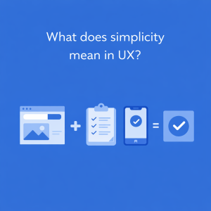
Simplicity does not mean simplistic or poor design. Simple design means:
Reducing the user’s mental load
Each additional decision consumes the user’s mental energy. According to Hick’s Law:
The more options a user has, the longer it takes to make a decision.
📌 Practical example:
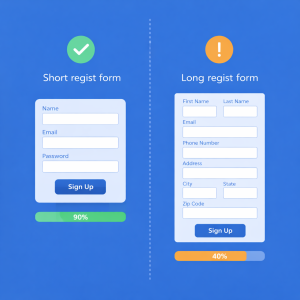
Short registration forms (name, email, password) have a much higher completion rate than long forms.
Increase Conversion Rate
Simple design directly impacts sales and customer acquisition.
📌 Real example – Google:
The Google homepage is one of the simplest designs in the history of the web. Just one input and one button. That simplicity has allowed billions of users to use it without training.

Better user experience on mobile
In app and web application design, screen space is limited. Simplicity becomes even more crucial on mobile.
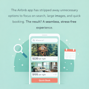
📌 Example – Airbnb:
The Airbnb app has stripped away unnecessary options to focus on search, large images, and quick booking. The result? A seamless, stress-free experience.
Remove extra elements
Every button, icon, or text should have a reason for being there.
📌 Key Question:
Does this element help the user make a decision?
Content Whitelisting (Visual Hierarchy)
The user should understand in the first 3 seconds:
What is this page?
What can it do?
📌 Example – Apple:
Apple product pages focus on just one main message. Less text, strong image, clear CTA.

Smart use of white space
White space is not the enemy of design; it is the friend of user experience.
📌 Example:
The website Medium has greatly increased the readability of its content by using a lot of white space.
Simplify the user journey
The user should reach the goal with the fewest clicks.
📌 Example in web application design:
Dashboards that display key information at a glance (such as Google Analytics).
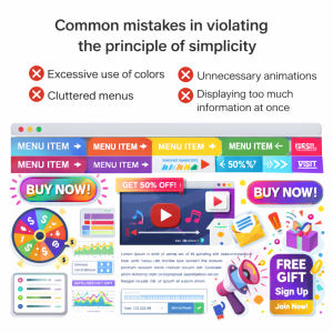
❌ Excessive use of colors
❌ Unnecessary animations
❌ Cluttered menus
❌ Displaying too much information at once